

Starting a career, internship, or university life brings new challenges, including how to dress. Colour theory for clothes helps you make choices that fit your skin, personality, and work environment. It’s not just a style hack. It shapes how others see you and affects your confidence.
Colour theory is the study of how colours interact. It breaks down into three elements: hue (the colour itself), value (how light or dark it is), and intensity (how bright or dull). This matters because colours don’t look the same on every skin or when paired with different shades. For example, bright colours pop on deep skin tones but can overwhelm lighter skin. Pastels might look soft and flattering on one, but washed out on another. Colour theory teaches you to see these differences and use them to your advantage. Colours also split into warm (reds, yellows, oranges) and cool (blues, greens, purples). Warm colours give energy but can be too loud for formal settings. Cool colours feel calm and professional. Knowing this helps when choosing work-appropriate clothes.
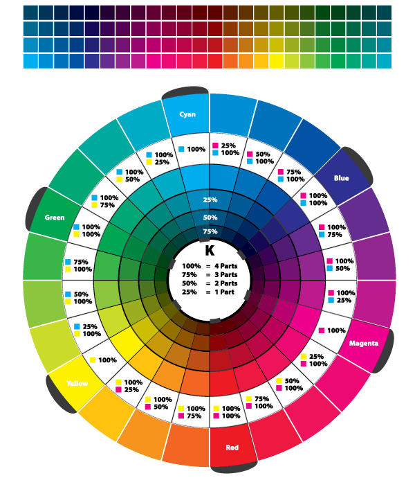
Picking clothes for work isn’t just about looking good; it’s about fitting the environment. Colour theory guides you to dress professionally and still express yourself. Choose colours that send the right signals. Blue, for example, means trust and calm. It’s common in corporate wear for this reason. Navy suits, light blue shirts, or muted teal sweaters work well. Red is powerful and passionate, but can be too aggressive for everyday office wear. Use it as an accent, like a tie or scarf. Neutral colours like black, white, grey, beige, and navy are your foundation. They balance bold hues and keep outfits grounded. For interviews or formal meetings, sticking to neutrals with one subtle pop of colour is usually best. Using complementary colours (colours opposite on the wheel, like blue and orange) can create visual interest. But be careful; pairing two strong colours at full intensity can clash and feel unprofessional. Instead, try desaturated (muted) tones or mix different levels of brightness to soften contrasts. Accessories give you room to play. A bright scarf, colourful socks, or a statement watch adds personality without overpowering your look.
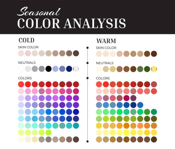
The secret to dressing well lies in knowing your skin undertone: warm, cool, or neutral. Warm undertones have a yellow, peachy, or golden hint. Greenish veins and gold jewellery flatter this group. Best colours include earthy tones like mustard, olive, coral, and warm browns. Cool undertones lean pink or blue with bluish veins and a silver jewellery preference. Jewel tones such as sapphire, emerald, and icy blue work well. Neutral undertones can wear a broad range, especially muted or toned-down colours. Wearing colours that clash with your undertone risks washing you out or making you look tired. For example, cool skin tones look better in blues than in yellow or orange. Personality also plays a role. If you’re bold and outgoing, brighter colours and contrasts might suit you. If you’re laid-back or formal, cooler, softer colours and monochrome schemes will likely feel more natural.
Colour schemes make it easier to build outfits without guesswork. Here are some top picks:
- Monochrome: Different shades of the same colour. This looks sleek and professional. Imagine a navy sweater with lighter blue jeans.
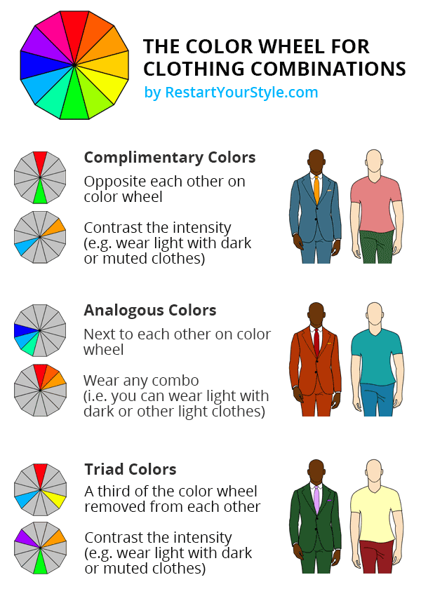
- Analogous: Colours next to each other on the wheel, like blue and green, or red and orange. These create harmony and are safe for offices.
- Complementary: Opposite colours like blue and orange, or red and green. Strong contrasts work if one colour is muted or used in small amounts.
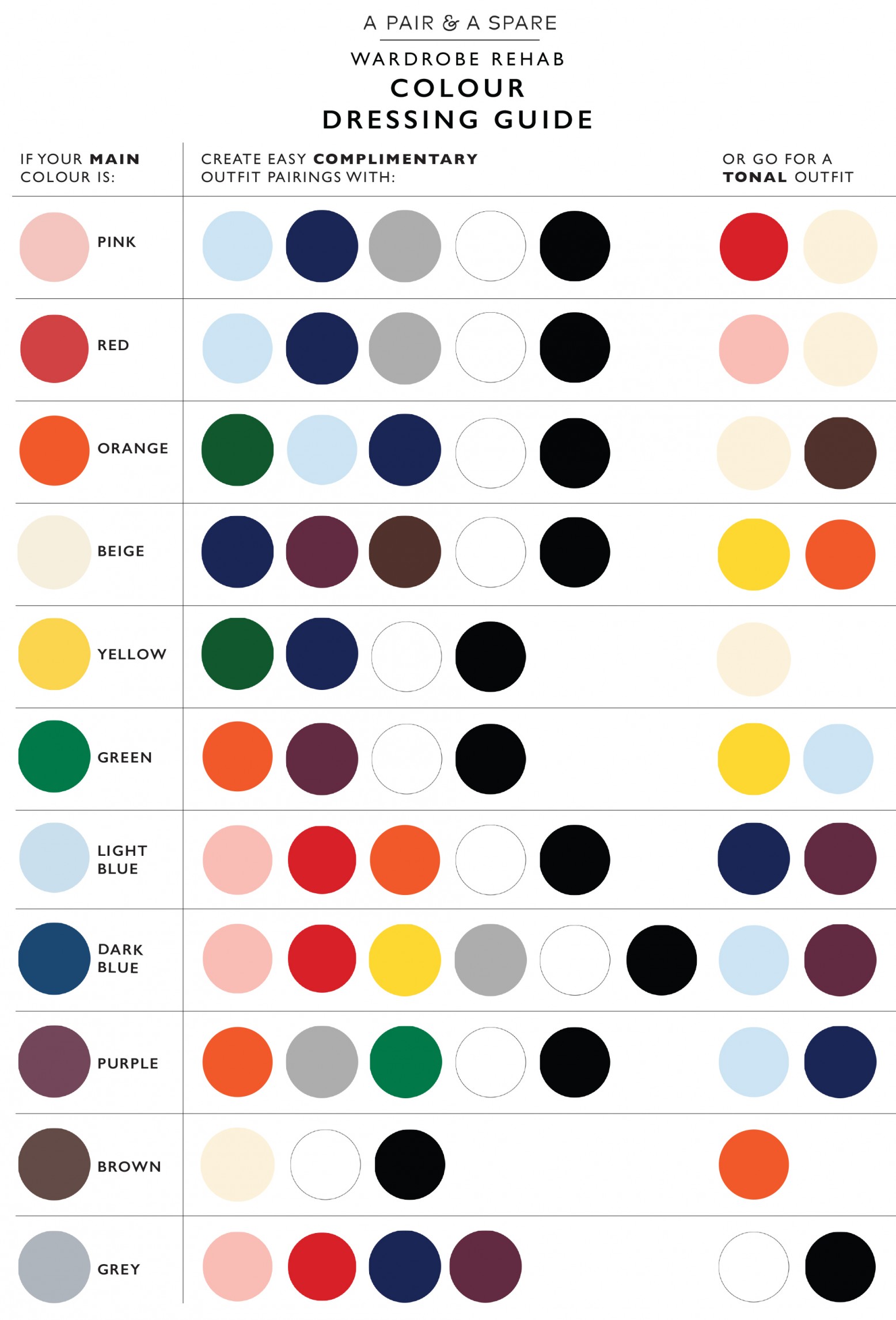
- Neutral base with accent: Start with black, navy, grey, white, or beige, then add one bright colour like burgundy or mustard for personality without fuss.
For beginners, neutrals plus one accent colour is safest. You get variety, can mix and match easily, and stay within dress codes.
Here are some tips and tricks for mastering colour in your wardrobe:
- Start with neutrals: Build your wardrobe on versatile basics: black, white, navy, grey. They mix with almost any colour and fit most workplaces. Once comfortable, add subtle colours.
- Test colours in natural light: Colours look different indoors and outside. Use daylight when trying on clothes to select shades that really suit you.
- Create capsule wardrobes: Choose a limited palette of 3 to 5 colours that suit your undertone and style. This makes dressing faster and ensures everything matches.
- Use a colour wheel app or chart: Help visualise how colours relate, making it easier to create balanced outfits.
- Learn to layer: Pair a neutral base with coloured layers like cardigans or scarves to adapt looks for different settings.
- Don’t ignore texture: Matte vs shiny fabrics catch light and colour differently. This can add subtle accents even within one colour family.
- Test accessories first: Before committing to coloured clothes, try bold accessories like belts, watches, and bags for a flavour of the colour.
- Mix warm and cool neutrals: Some neutrals lean warmer (like camel or cream), others cooler (charcoal or icy white). Mixing both can add depth.
- Keep a colour journal: Note which colours get compliments or make you feel confident. Over time, patterns will show what suits you best.
- Be mindful of prints: Prints combine colours but can be intimidating. Start with simple, soft prints before experimenting with busy patterns.
Common pitfalls while choosing colour and how to avoid them:
- Wearing colours too close to your skin tone: This is a classic wardrobe mistake. Colours that mirror your skin tone too closely can make you look washed out, tired, or pale. For example, very light beige or peach hues might blend into light skin, while some browns might do the same for deeper skin tones. The solution is to choose colours that create contrast with your skin without being jarring, think medium shades that highlight your natural tones instead of blending in.
- Overloading with bright colours: Wearing multiple bright colours full-strength at once can be overwhelming, especially in professional settings. This can make your outfit look uncoordinated or youthful in a way that might not fit your workplace. To avoid this, use bright colours as accents rather than the base of your outfit. For instance, pair a subtle neutral suit with a vibrant tie or scarf to add energy without distraction.
- Colour burnout: Colour burnout is real, it’s when you stick to the same colour or palette so often that you get bored and your look becomes predictable. This stagnation affects how you feel and how others perceive you. Rotate your colours regularly, experiment with new shades, and use accessories to diversify your look.
- Ignoring Your undertones: Many skip analysing their undertones and grab whatever is trending or popular. This often leads to colours that clash with the skin undertone, making the wearer look less vibrant or even sickly. Invest some time in identifying your undertones (warm, cool, or neutral) and choose colours accordingly. It pays off immediately.
- Too much matchy-matchy: Matching every item perfectly (shoes, belt, bag, shirt) may seem polished, but can feel boring or overly rigid. Mixing colours and textures thoughtfully creates visual interest and shows personality. For example, a navy blazer with a light blue shirt and tan belt is more engaging than navy everything.
- Overlooking the work environment’s dress code: Not all workplaces welcome bold colour choices. Some industries or offices prefer muted, conservative palettes. Ignoring this can make outfits feel out of place or unprofessional. Research your workplace culture and adapt. Add colour wisely where allowed, and keep the overall look appropriate.
- Failing to consider lighting: Clothes often look different indoors, especially under artificial light, compared to natural daylight. A colour that pops in the store might dull down in the office or vice versa. Always test clothing colours in different lighting conditions to avoid surprise disappointments.
- Forgetting the impact of fabric and texture: Fabric changes how colour appears. Shiny satin reflects light and looks brighter, while matte cotton absorbs light and softens colours. Two pieces in the same colour but different fabrics can look very different. Understanding this helps in mixing and layering colours without clashes.
- Underestimating the power of neutral colours: Young adults often rush to buy colourful wardrobes, forgetting how vital neutrals are for balance. Too few neutrals can make dressing more complicated and your looks less versatile. Invest in solid neutrals like black, grey, navy, and white; they anchor your outfits and make colours pop.
- Relying too much on trends: Trendy colours come and go. Building a wardrobe relying only on the latest popular colours can date your clothes fast. Focus on classic and flattering colours that fit you well and integrate trends through small additions like ties or scarves.

Thinking about colour as just “like or don’t like” isn’t enough. Use the colour wheel, know your undertones, and pick shades that send the right messages for your setting. Your look builds confidence. If you feel good in what you wear, you perform better. If your outfit blends well with the environment but lets you shine subtly, you make positive impressions.
Consider these extras:
- Accessories as punctuation marks, small, punchy colour hits.
- Don’t match everything perfectly; contrast adds interest.
- Hair, makeup, and jewellery also play roles in your colour story.
Colour theory in fashion isn’t about rigid rules but smart choices. For young adults stepping into new roles, mastering it means looking polished and feeling authentic. Choose your colours to suit your skin, personality, and career stage. There is no need to follow trends blindly. Build a wardrobe you can wear confidently. And remember, a little colour knowledge goes a long way.
