Sacred Stones, Spaces, and Stories: Ashtavinayaka Part 4

In the lush, rolling hills of Maharashtra’s Raigad district, nestled between the ancient Sarasgad fort and the gentle flow of the Amba River, stands the Ballaleshwar Temple at Pali, one of the eight sacred Ashtavinayak shrines dedicated to Lord Ganesha. Unique among Ganesha temples, Ballaleshwar is the only incarnation of the deity known by the name of his devotee rather than his own. This temple is not only a centre of deep spiritual resonance but also a living testament to the transformative power of unwavering devotion.

Pali is a picturesque village, approximately 30 km from Karjat, surrounded by verdant hills and blessed with natural beauty. The temple’s location, between the imposing Sarasgad fort and the tranquil Amba river, imbues the site with a sense of protection and serenity. Two lakes flank the temple, their waters used for ritual purposes and adding to the sanctity of the environment.

The story of Ballaleshwar is inseparable from that of Ballal, a young boy whose devotion to Lord Ganesha was so profound that it changed the course of his life and the spiritual landscape of Pali forever. Ballal was the son of Kalyansheth, also called Kalyan or Kalyani Seth, and Indumati, a wealthy and respected couple in the village. While his parents were initially childless, they were eventually blessed with Ballal, who from an early age showed an extraordinary inclination toward worship and spirituality.

Ballal’s devotion was infectious. He would gather his friends and lead them into the forest to conduct elaborate rituals, using stones as makeshift idols of Lord Ganesha. So engrossed were the children in their prayers that they would lose track of time, often returning home late. This behaviour soon drew the ire of the other villagers, whose complaints reached Ballal’s father.

Angered by Ballal’s neglect of worldly duties and the complaints of the villagers, Kalyansheth stormed into the forest. There, he disrupted the children’s worship, threw away the Ganesha idol, destroyed the pandal, or the temporary shrine, and beat Ballal mercilessly. To punish him further, he tied Ballal to a tree, taunting him to see if his beloved Ganesha would come to his rescue.

Despite his pain and injuries, Ballal’s faith never wavered. He continued to chant Ganesha’s name, his prayers echoing through the forest. Moved by such unshakeable devotion, Lord Ganesha appeared before Ballal in the guise of a Brahmin. Ganesha untied the boy, healed his wounds, and asked him to make a wish. Ballal, ever selfless, requested that Ganesha remain in Pali and bless all devotees who came to worship him there. Pleased, Ganesha agreed, promising to take Ballal’s name before his own, thus becoming Ballaleshwar, “the Lord of Ballal.”

The stone idol that Ballal’s father had thrown away was later found and installed near the main temple as Dhundi Vinayak. Tradition holds that devotees must first pay respects to Dhundi Vinayak before entering the Ballaleshwar temple, acknowledging the resilience of faith even in adversity.

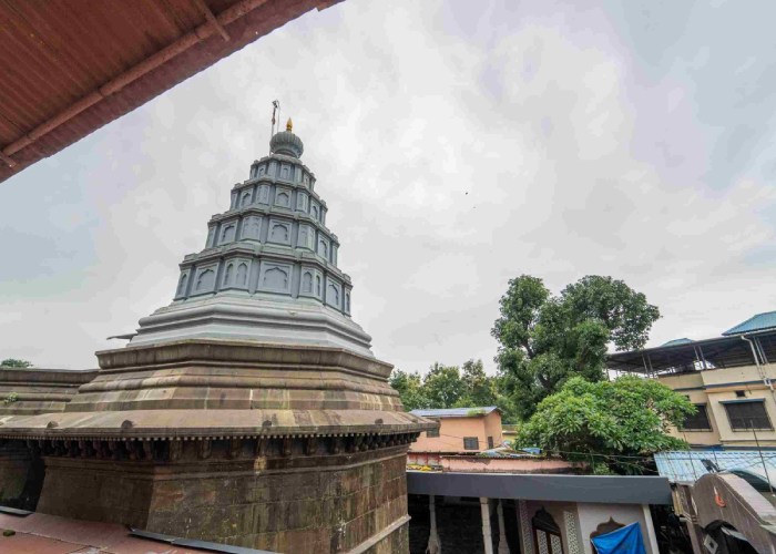
The original temple at Pali was a simple wooden structure, its date of origin lost to history. The current stone temple was reconstructed in 1640 by Moreshwar Vitthal Sindkar and later renovated by Nana Phadnavis in 1760. The temple faces east, and its design is such that during Dakshinayana, the period when the sun moves southward, the first rays of the morning sun fall directly on the main idol, a marvel of ancient engineering and devotion. The temple itself is shaped like the sacred “Shree” symbol in Devanagari script, further emphasising its spiritual significance.

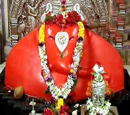
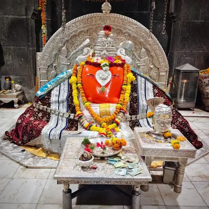
The idol of Ballaleshwar is three feet tall, seated on a stone throne with a silver backrest. The idol’s trunk turns to the left, and its eyes and navel are studded with precious diamonds. Uniquely, Ganesha is depicted here in the attire of a Brahmin, a nod to his appearance before Ballal. On either side of the idol stand are Riddhi and Siddhi, the goddesses of prosperity and spiritual power, waving chamaras, or fly-whisks, in service.

Two lakes, one on either side of the temple, provide water for rituals. The lake on the right is especially significant, as its water is used for the deity’s daily worship and other auspicious occasions.

The temple is a hive of activity throughout the year, with daily rituals conducted following ancient tradition. The day begins with the early morning aarti, the Kakad Aarti, awakening the deity and invoking his blessings. Offerings of food, Neivedhya, are made to the deity and later distributed as prasad to devotees. Maha Aarti is held at noon and in the evening; these aartis are accompanied by devotional singing and the rhythmic clanging of bells. Shej Aarti is the final ritual of the day, performed before the deity is symbolically put to rest.

A unique tradition at Ballaleshwar is that devotees must first seek the blessings of Dhundi Vinayak, the stone idol thrown away by Ballal’s father, before entering the main temple. This act honours the resilience of faith and the sanctity of all forms of devotion, however humble their origins. During Dakshinayana, the temple’s east-facing design allows the first rays of the sun to illuminate the main idol, symbolising the dispelling of darkness and ignorance by divine light.

On the fourth day of the Bhadrapada month, a special Maha Bhog, or grand offering, is made to the deity. It is believed that the imprint of Ganesha’s fingers can be seen on the offerings, a miraculous sign that draws thousands of devotees to witness and receive blessings on this auspicious day.

During the Magh festival, the third day is marked by a grand palkhi, or palanquin, procession. The idol is carried through the village, accompanied by singing, dancing, and bands, as devotees join in a vibrant celebration of faith.

The Bhadrapadi Utsav, held from the first to the fifth day of the bright fortnight in the month of Bhadrapada, is one of the temple’s main festivals. The temple is adorned with colourful lights, and the air resonates with the sounds of bhajans, devotional songs, kirtans or spiritual discourses, and traditional music. Eminent scholars and local literati participate, recounting the birth and exploits of Lord Ganesha.

The Maghi Utsav, celebrated from the first to the fifth day of the bright fortnight in the month of Magh, is another major festival. The highlight is the evening palkhi procession, which winds through the village with much fanfare. Devotees are blessed with prasad after the procession, and the entire temple complex is suffused with joy and spiritual fervour.

Every month, on the fourth day of the waxing moon, Chaturthi, the temple witnesses a surge of devotees. Special decorations, rituals, and offerings mark these occasions, reinforcing the temple’s role as a living centre of faith and devotion.

Ballaleshwar is unique among the Ashtavinayak temples, and indeed, among all Ganesha shrines, in being named after a devotee rather than the deity himself. This reflects the deep Hindu belief in the power of bhakti or devotion to move the divine, and the reciprocal relationship between the devotee and the deity. The story of Ballal is a powerful reminder that true devotion is characterised by innocence, persistence, and selflessness. Ballal’s unwavering faith, even in the face of suffering, is held up as an ideal for all devotees.

The temple’s eastward orientation and the phenomenon of sunlight illuminating the idol are rich in symbolism, representing the triumph of light over darkness, knowledge over ignorance, and faith over adversity.

In My Hands Today…

Dethroned: The Downfall of India’s Princely States – John Zubrzycki

On 25 July 1947, India’s last Viceroy, Lord Louis Mountbatten, stood before the Chamber of Princes in New Delhi and prepared to deliver the most important speech of his career. He had just three weeks to convince more than 550 sovereign princely states–some the size of Britain, some so small that cartographers had trouble locating them–to become part of a free India. Once Britain’s most faithful allies, the princes could choose between joining India or Pakistan, or declaring their independence.

This is a saga of promises and betrayals, of brinkmanship and intrigue. Mountbatten worked with two of independent India’s founding fathers–the country’s most senior civil servant, V.P. Menon, and Congress strongman Vallabhbhai Patel–to save the subcontinent from self-destruction. What India’s architects described as a ‘bloodless revolution’ was anything but, as violence engulfed Kashmir and Indian troops put an end to Hyderabad’s dreams of independence.

Most states accepted the inevitable, giving up their kingdoms in exchange for guarantees that their privileges and titles would be preserved in perpetuity. Instead, they were led to their extinction–not by the sword, but by political expediency, leaving them with little more than fading memories of a glorified past.

Benefits of an afternoon nap

In today’s fast-paced world, where productivity and efficiency are often prioritised over rest, taking an afternoon nap might seem counterintuitive. However, science and tradition both suggest that this simple practice can offer profound benefits for physical health, mental acuity, emotional well-being, and overall productivity.

The need for an afternoon nap varies among individuals due to biological, lifestyle, and environmental factors. Some key reasons are:

Circadian rhythms: Human circadian rhythms naturally dip in the early afternoon, leading to a decrease in alertness and energy levels. This phenomenon is often referred to as the “post-lunch dip” or “afternoon slump.” The release of melatonin, a hormone that regulates sleep, occurs not only during nighttime but also slightly after lunch, biologically programming many people to feel drowsy during this time.

Sleep deficiency: People who do not get adequate sleep at night often feel the need for a nap during the day. Adults require seven or more hours of sleep per night to maintain optimal health; insufficient sleep can lead to fatigue, impaired cognitive function, and mood disturbances.

Age-related changes: Older adults frequently experience changes in their sleep patterns due to aging. They may sleep less at night and rely on daytime naps to compensate for reduced nighttime rest.

Lifestyle factors: High-stress jobs, irregular work schedules (e.g., shift work), or physically demanding activities can increase the likelihood of daytime sleepiness. For these individuals, an afternoon nap serves as a restorative break.

Health conditions: Certain medical conditions such as sleep apnea or chronic fatigue syndrome may necessitate daytime naps as part of managing symptoms.

To understand why an afternoon nap is beneficial, it’s essential to examine the ideal sleep schedule for adults. Sleep experts recommend a combination of nighttime rest and occasional daytime naps for optimal health.

Adults should aim for 7–9 hours of uninterrupted sleep per night. This duration is critical for maintaining physical health, cognitive function, and emotional balance. Sleep occurs in cycles comprising light sleep, deep sleep, and REM (rapid eye movement) sleep, all of which serve distinct purposes. Research indicates that naps taken early in the afternoon before 3 pm are most effective. Napping later in the day can disrupt nighttime sleep patterns. The ideal nap length is 20–30 minutes for a quick energy boost without entering deep sleep stages that may cause grogginess upon waking. For individuals recovering from significant sleep debt or engaging in intense physical activity, longer naps may be appropriate. Maintaining regularity in both nighttime sleep and napping schedules is crucial for long-term health benefits. Irregular sleeping patterns can lead to circadian rhythm disruptions.

Why is an afternoon nap essential for productivity? An afternoon nap offers numerous benefits that directly impact productivity and overall performance during the second half of the day.

A short power nap can significantly improve alertness, concentration, and decision-making abilities. Studies show that napping enhances memory consolidation by transferring information from short-term to long-term storage. This is particularly useful for professionals who need to retain complex information or solve problems creatively.

Napping has been shown to elevate mood by reducing stress hormones like cortisol while increasing serotonin levels. Well-rested individuals are less likely to experience irritability or emotional fatigue, making them better equipped to handle challenges later in the day.

Chronic stress can impair productivity by affecting focus and motivation. Afternoon naps provide a mental reset by promoting relaxation and reducing anxiety levels. For individuals engaged in physical activities or sports, napping enhances reaction times, coordination, and stamina. It also aids muscle recovery after intense workouts.

Creative professionals often find that napping stimulates imagination and problem-solving skills by allowing neural connections in the brain to realign during rest periods. Fatigue is a major contributor to workplace errors and accidents. A brief nap improves alertness and reaction times, reducing risks associated with drowsiness.

Beyond productivity gains, afternoon naps contribute significantly to overall health. Regular napping has been linked to lower blood pressure and a reduced risk of heart disease. Naps promote heart health by decreasing stress levels and inflammation. Adequate rest strengthens immune function by regulating cytokine production, proteins essential for fighting infections. Naps complement nighttime sleep in ensuring immune resilience. Cultures where napping is common often report longer life expectancies due to the improved physical and mental well-being associated with regular midday rest.

To maximise the benefits of an afternoon nap while avoiding potential downsides like grogginess or disrupted nighttime sleep, keep it short and limit naps to 20–30 minutes unless recovering from severe fatigue, nap early and aim to nap before 3 pm. Create a comfortable environment by using a quiet space with dim lighting and avoid caffeine before napping, as stimulants can interfere with the ability to fall asleep. Lastly, perhaps the most important tip is to listen to your body and pay attention to signs of fatigue or reduced focus as cues for when a nap might be beneficial.

An afternoon nap is far more than just a luxury; it’s a scientifically supported practice with wide-ranging benefits for cognitive function, emotional well-being, physical health, and productivity. While not everyone may feel the need for daytime rest due to individual differences in lifestyle or biology, incorporating a short nap into your routine can be transformative, especially during periods of high stress or fatigue.

By understanding your body’s natural rhythms and optimising your sleep schedule with both nighttime rest and strategic napping, you can unlock greater energy levels and efficiency throughout your day while promoting long-term health benefits that extend far beyond just feeling refreshed after lunch.

In My Hands Today…

The Daughters of Kobani: A Story of Rebellion, Courage, and Justice – Gayle Tzemach Lemmon

The extraordinary story of the women who took on the Islamic State and won.

In 2014, northeastern Syria might have been the last place you would expect to find a revolution centered on women’s rights. But that year, an all-female militia faced off against ISIS in a little town few had ever heard Kobani. By then, the Islamic State had swept across vast swaths of the country, taking town after town and spreading terror as the civil war burned all around it. From that unlikely showdown in Kobani emerged a fighting force that would wage war against ISIS across northern Syria alongside the United States. In the process, these women would spread their own political vision, determined to make women’s equality a reality by fighting—house by house, street by street, city by city—the men who bought and sold women.

Based on years of on-the-ground reporting, The Daughters of Kobani is the unforgettable story of the women of the Kurdish militia that improbably became part of the world’s best hope for stopping ISIS in Syria. Drawing from hundreds of hours of interviews, bestselling author Gayle Tzemach Lemmon introduces us to the women fighting on the front lines, determined to not only extinguish the terror of ISIS but also prove that women could lead in war and must enjoy equal rights come the peace. In helping to cement the territorial defeat of ISIS, whose savagery toward women astounded the world, these women played a central role in neutralizing the threat the group posed worldwide. In the process, they earned the respect—and significant military support—of U.S. Special Operations Forces.

Rigorously reported and powerfully told, The Daughters of Kobani shines a light on a group of women intent on not only defeating the Islamic State on the battlefield but also changing women’s lives in their corner of the Middle East and beyond.

The Symbolic Storytellers: How Famous Logos Shape Our World

Logos are more than just visual symbols; they are the face of a brand, encapsulating its identity, values, and mission in a single image. Over time, certain logos have transcended their commercial purposes to become global icons.

Logos are more than just visual identifiers; they are powerful tools for storytelling that connect brands with their audiences emotionally and intellectually. Why? Logos make brands memorable, a well-designed logo fosters credibility, and unique logos set brands apart from competitors. By combining aesthetics with meaning, iconic logos have achieved global recognition while effectively communicating their brand values.

Cultural differences play a significant role in shaping how logos are perceived globally. These differences influence the emotional, symbolic, and psychological impact of logo elements such as colours, symbols, typography, and layout.

Colours carry distinct meanings in different cultures, which can significantly alter how a logo is interpreted. White often symbolises purity and innocence in Western cultures, while in many Eastern cultures, it represents mourning and death. Red signifies luck and celebration in China but is associated with danger or warning in Western contexts. In Islamic cultures, gr. een is linked to prosperity and faith, while in Western contexts, it often represents nature or eco-friendliness. Designers must carefully select colour palettes to ensure they evoke the intended emotions within specific cultural contexts.

Symbols can have vastly different meanings depending on cultural backgrounds. A lion might symbolise courage and strength in Western cultures but could have different connotations elsewhere. Circular logos may symbolise unity and harmony in some Asian cultures, while angular designs might be perceived as aggressive or dynamic. The use of religious or historical symbols can either resonate deeply or alienate audiences if not handled sensitively. For example, Starbucks’ siren logo resonates globally but might be interpreted differently in regions with conservative views on mythology or nudity.

Typography also plays a crucial role in cultural perception. Serif fonts are often associated with tradition and formality in Western cultures, while sans-serif fonts convey modernity and simplicity. The choice of script must align with linguistic conventions. For instance, playful fonts may be well-received by younger audiences in Western markets but could be seen as unprofessional in Middle Eastern contexts. Logos designed for left-to-right reading may need adjustments for audiences accustomed to right-to-left scripts or top-to-bottom layouts.

Cultural insensitivity can lead to backlash or misinterpretation. PepsiCo faced challenges when its slogan “Pepsi brings you back to life” was translated into Chinese as “Pepsi brings your ancestors back from the grave,” highlighting the importance of linguistic precision. Airbnb’s 2014 logo was criticised for resembling anatomical features, demonstrating how unintended associations can lead to negative publicity even when not explicitly tied to cultural differences. Brands must collaborate with local experts to avoid such pitfalls.

To resonate with diverse audiences, brands often adapt their logos. Incorporating local motifs can foster a sense of belonging. For instance, Coca-Cola has used localised designs during festivals like Ramadan or Chinese New Year. Subtle changes in colour schemes can make logos more appealing to specific regions while maintaining brand identity. Adjusting fonts to match local preferences ensures that logos communicate effectively across languages and scripts.

Logos serve as cultural ambassadors for brands by bridging divides and fostering inclusivity. Logos that reflect cultural diversity demonstrate respect for local traditions and values. Successful cross-cultural logos balance global recognition with local relevance, creating a sense of unity while celebrating diversity. For example, McDonald’s adapts its Golden Arches by incorporating local elements like green hues in European markets to signify eco-consciousness.

Let’s deep dive into some of the most famous and recognisable logos and their meanings:

Apple: The Bite of Knowledge and Innovation
The Apple logo is one of the most iconic symbols in technology. Its sleek design, a bitten apple, has sparked numerous interpretations. Some believe it references the biblical story of Adam and Eve, symbolising knowledge and temptation. Others see it as a nod to Alan Turing, the father of modern computing, who allegedly died after biting into a poisoned apple. Regardless of its origins, the logo embodies simplicity, innovation, and creativity, aligning perfectly with Apple’s brand ethos.

Nike: The Swoosh of Motion
Nike’s “Swoosh” logo is synonymous with athleticism and movement. Designed by Carolyn Davidson in 1971, the swoosh represents motion and speed, inspired by the wings of Nike, the Greek goddess of victory. Over the years, this minimalist design has become a global symbol of sports excellence and perseverance. Paired with the slogan “Just Do It,” it inspires millions to push their limits.

Coca-Cola: A Script of Nostalgia
The Coca-Cola logo is a timeless classic that has remained largely unchanged since its creation in 1886. Its flowing cursive script exudes energy and vitality, mirroring the effervescence of the drink itself. The red-and-white color scheme evokes passion and purity, making it instantly recognisable worldwide. This logo represents not only a beverage but also a lifestyle filled with joy and refreshment.

McDonald’s: The Golden Arches
McDonald’s iconic Golden Arches symbolise more than just fast food; they represent comfort, reliability, and global reach. The arches form a stylised “M,” evoking openness and inclusivity. The vibrant red and yellow colors are designed to stimulate appetite while conveying speed and efficiency, key elements of McDonald’s brand identity.

Google: A Playful Palette
The Google logo is as vibrant as the company itself. Its multicoloured design reflects diversity, creativity, and innovation: core values that define Google’s mission to make information accessible to everyone. The choice of primary colours, with green breaking the pattern, signifies playfulness and approachability, making it one of the most recognised logos globally.

Amazon: Smiling from A to Z
Amazon’s logo is deceptively simple yet packed with meaning. The orange arrow beneath the wordmark doubles as a smile, symbolizing customer satisfaction. It also points from “A” to “Z,” highlighting Amazon’s vast product range. This clever design encapsulates convenience, variety, and happiness, hallmarks of Amazon’s service.

Starbucks: The Siren’s Allure
Starbucks’ logo features a twin-tailed mermaid or siren, a nod to its maritime origins in Seattle and its seductive allure as a coffee brand. Inspired by a 16th-century Norse woodcut, the logo symbolises community and indulgence while maintaining an air of sophistication through its green-and-white palette.

FedEx: Hidden Speed
The FedEx logo is renowned for its hidden arrow between the “E” and “X,” symbolising speed and precision in delivery services. This subtle yet powerful design element underscores FedEx’s commitment to reliability and efficiency while maintaining a clean, professional aesthetic.

Microsoft: A Window into Innovation
Microsoft’s logo features four coloured squares forming a window: a metaphor for opportunity and innovation in technology. Each colour represents a different product line: blue for Windows OS, red for Office Suite, green for Xbox, and yellow for future possibilities. This modern design reflects Microsoft’s versatility and forward-thinking approach.

Walt Disney: A World of Magic
The Walt Disney logo is an enchanting representation of childhood wonder and creativity. Its custom typography evokes nostalgia while capturing Disney’s playful spirit. Often accompanied by an image of Cinderella’s castle or fireworks, this logo invites audiences into a magical world full of imagination.

Adidas: The Three Stripes
Adidas’ three-stripe logo symbolises performance and endurance in sportswear. Originally designed to stabilise shoes, the stripes have evolved into a global emblem representing resilience and athletic achievement.

Visa: Trust in Blue
Visa’s logo uses blue to evoke trustworthiness and reliability: qualities essential for a financial services company. Its clean typography reflects modernity while emphasising security in transactions worldwide.

Shell: Energy Personified
Shell’s yellow-and-red scallop shell design reflects its roots in oil exploration while symbolising energy and sustainability today. The bright colours make it stand out at service stations globally.

IBM: Stripes of Progress
IBM’s striped blue wordmark conveys stability and innovation simultaneously. The parallel lines suggest speed and efficiency while maintaining an approachable corporate identity.

Target: Bullseye Simplicity
Target’s red bullseye is one of the simplest yet most effective logos globally. It symbolises precision while reflecting Target’s goal to be at the center of consumers’ shopping needs.

Logos are critical in defining a brand’s identity, but when poorly designed, they can confuse, alienate, or even offend audiences. The London 2012 Olympics logo faced widespread criticism for being overly abstract and difficult to interpret. Designed to represent the numbers “2012,” many viewers found it visually jarring and disconnected from the spirit of the event. Additionally, some perceived hidden inappropriate imagery within the design, further fueling backlash. Over 48,000 people signed a petition to scrap the logo, citing its failure to represent London or the Olympics effectively.

Gap’s attempt to modernise its logo in 2010 was met with immediate public outrage. The new design replaced the iconic serif font with Helvetica and added a small blue square, which critics described as bland and uninspired. Within days of its launch, backlash on social media prompted Gap to revert to its original logo. The failure stemmed from a lack of consumer consultation and an emotional disconnect with loyal customers who felt alienated by the abrupt change.

Pepsi’s redesign of its globe logo aimed to evoke smiles but instead confused consumers. The tilted white stripe was inconsistent across product lines, leading to criticism that it resembled a “fat man.” Despite spending $1 million on the redesign, Pepsi faced negative feedback for its lack of creativity and failure to resonate with customers accustomed to the previous design.

Tropicana’s rebranding involved changing its packaging design rather than the logo itself, but it serves as an example of how visual identity impacts perception. The new design removed familiar elements like the orange-with-a-straw image, making it look generic and hard to distinguish from competitors. Consumer backlash was so strong that Tropicana reverted to its original packaging within two months.

Animal Planet’s decision to replace its elephant-themed logo with a sideways “M” was widely criticized for losing its niche representation. The new design failed to communicate the channel’s focus on wildlife and nature, leaving audiences disconnected from its purpose. This arbitrary change resulted in a setback for the brand.

Bing’s 2013 redesign aimed for simplicity but lacked originality and failed to stand out against competitors like Google. The uninspired design contributed to Bing’s struggle in gaining traction among users.

A satellite company’s logo merged “Sat” and “An” without proper spacing, resulting in an unintended association with Satan—a clear example of how typography can lead to disastrous branding outcomes.

Key reasons why logos fail include a misalignment with brand identity, poor execution, overcomplication or oversimplification, ignoring consumer feedback, and cultural sensitivity issues. Failed logos offer valuable insights into effective branding. These include conducting thorough market research before launching a redesign, testing logos across different demographics and cultural contexts, prioritising simplicity while ensuring symbolic significance, and consistently aligning visual identity with brand values. By learning from these mistakes, brands can create logos that resonate deeply with their audiences while avoiding costly missteps.

In conclusion, each famous logo carries its own story: a blend of history, culture, design ingenuity, and branding strategy that resonates across borders and generations.