

People shape their days around habits, often without noticing. Habits make life easier but can trap people in cycles they’d rather not repeat. The science behind these patterns shows that old advice to just “try harder” is mostly noise. Building good habits and breaking bad ones takes patience, not willpower alone. Here’s why, what’s at stake, and what’s actually proven to work.
Habits Are How the Brain Saves Energy
A habit is any behaviour done automatically, usually triggered by a cue, an emotional state, a place, a time of day, or something else. The action is fast and feels effortless. Brushing teeth, checking a phone after hearing a buzz, or slouching after work are all habits. Scientists say habits exist because the brain is trying to save effort. By turning repeated actions into automatic routines, people stop wasting energy on small decisions. This automation lets people focus elsewhere.
If habits are just brain shortcuts, why do some get stuck with routines that harm? That’s the catch: Automation works for useful behaviours, like fastening seatbelts, but also locks in snacking, nail-biting, doom-scrolling, and arguments. The brain doesn’t judge which habit is good or bad. If something brings a sense of reward after a cue, the pattern forms. The design isn’t moral, it’s mechanical.
Some worry this means they have no control. But while habits are automatic, they’re not destiny. People can reshape them with the right approaches, though it rarely happens overnight.
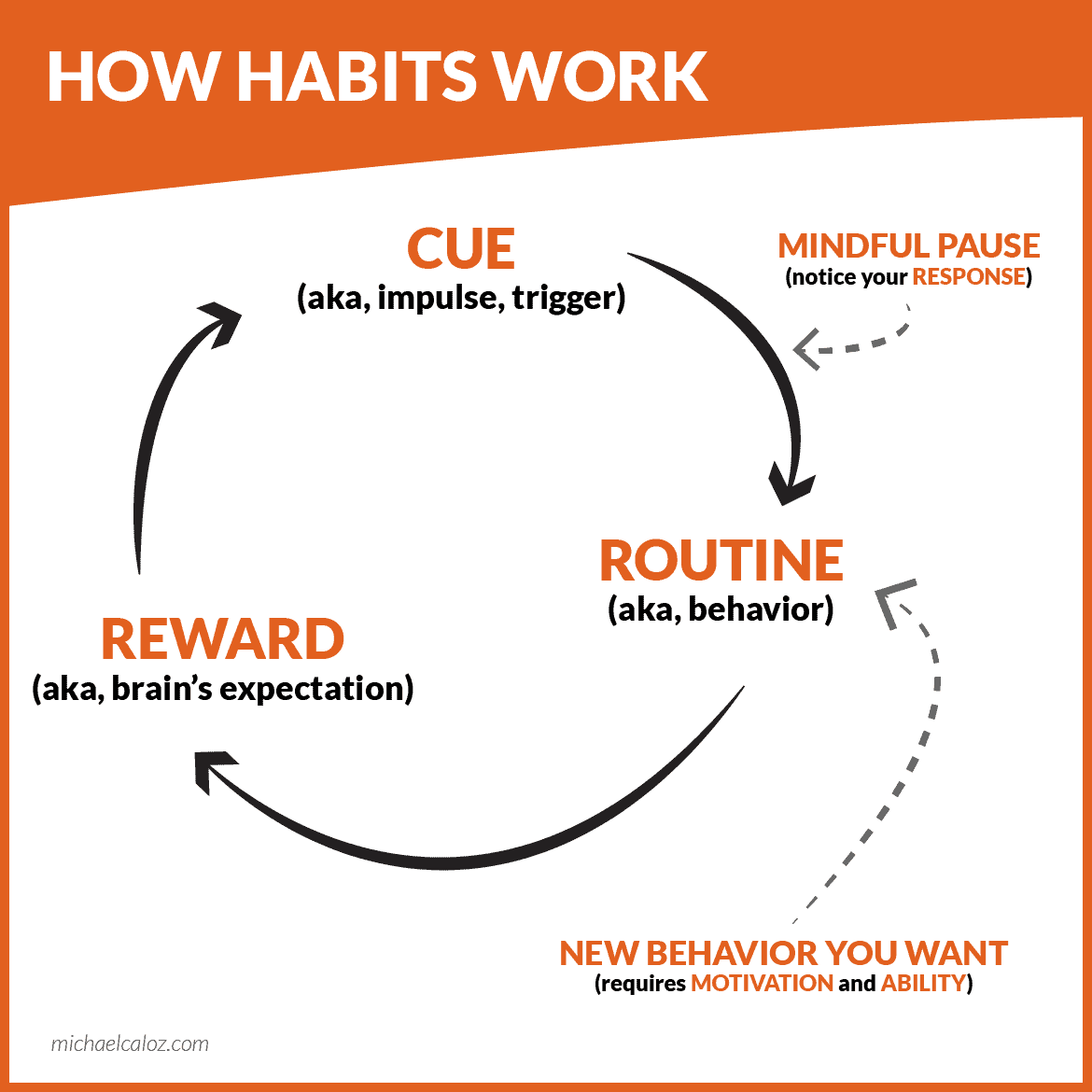
The Three-Part Structure of Every Habit
Every habit follows the same core loop: cue, routine, reward. This loop explains both positive and negative routines.
- Cue: A trigger, internal or external. For example, a feeling of boredom, the smell of coffee, or getting into a car.
- Routine: The actual action; pouring coffee, checking emails, lighting a cigarette.
- Reward: Some payoff for the brain, which could be relief, a surge of pleasure, or just a feeling of “job done.” Rewards cement the habit loop, making the brain more likely to repeat the process next time.
Most don’t notice this loop at work. Routines often start with intention, maybe to avoid stress or just relax. Repetition ties the loop more tightly, making the action slip into autopilot. Once that happens, people aren’t making choices; the sequence just fires.
Assuming anyone can “just snap out of it” ignores what makes habits tick. Conscious choice fades while automatic responses take over. That’s why change is tough.
Good Habits: The Upside (and Limits) of Routine
When habits reinforce healthy actions like exercising, saving money, and calling friends, life gets easier. People don’t have to use up willpower every day for small things; the brain handles routines behind the scenes. Good habits clear time and attention for bigger decisions.
But even so-called positive habits have drawbacks. Relying too much on automatic actions may lead to boredom or a sense of living on autopilot. Sometimes, “good” habits like going to the gym every day become excessive or compulsive. Also, what counts as a good habit is partly context-driven. Working late might look productive, but it destroys sleep, for example. This complicates the idea that more habits are always better.

Bad Habits: Trapdoors for the Mind
Bad habits feel like prisons because they happen so easily, and resisting them uses up mental resources. They often start as reasonable responses: a cookie after a long day, scrolling through social media to unwind, but the problem is persistence. When the routine no longer serves a real need or actively harms, it’s hard to stop because the habit loop keeps firing.
Research shows bad habits often draw strength from emotional cues: stress, fatigue, loneliness. These patterns can reinforce themselves, making it harder to break out as time goes on. This means that blaming a lack of willpower misses the real issue; habits keep running whether people mean them to or not.
And the consequences can be serious. Overeating, procrastinating, smoking, and even repeated negative thinking have been linked to worse physical and mental health. Relationships strain, opportunities are lost, and self-esteem drops. Bad habits don’t just waste time; they can shape entire lives for the worse.
Challenging Common Assumptions: Is It All About Choice?
It’s common to hear that people just need to “decide” to change. But this view overestimates control. Once a habit forms, decision-making drops out, and the pattern repeats. People can’t outthink habits all the time.
Others believe that one needs strong motivation every single day to build habits. Motivation matters, but it fades. Habits that require constant attention are weak. The way out is to create routines that get easier over time, not harder. Relying on willpower alone burns people out. Designing the environment or shifting cues is more powerful than relying on inner resolve.
Some even claim that breaking bad habits is about “fighting the urge” until it goes away. This approach can backfire. Focusing on suppressing the action (and feeling guilty about failure) often reinforces the very behaviours people want to avoid. Awareness, curiosity, and replacing the habit work better.
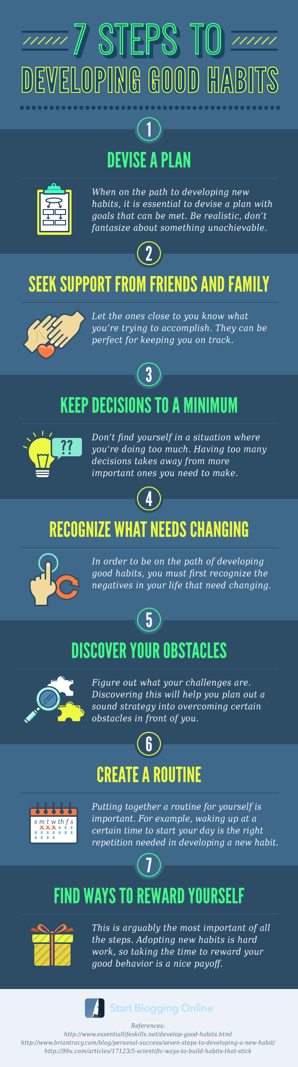
What Actually Works to Build Good Habits
Building habits needs consistency and a bit of patience. Studies show it can take anywhere from 18 days to eight months to lock in a new pattern, with the average being around 66 days. The key is repeating the behaviour enough times in the same context until it happens almost automatically.
Instead of big resolutions, small changes work best at first. Trying to become a marathon runner overnight leads to failure; walking five minutes a day is within reach and easier to repeat. Repetition, not intensity, is what matters.
Setting clear cues helps. If the plan is to read more, tie it to a fixed time or place, like reading before bed or during coffee breaks. Preparing beforehand, like putting a book on the pillow, makes the routine harder to miss.
Rewards also matter, even small ones. Feeling proud of sticking to a new practice helps lock it in. Sometimes, the reward is built into the activity (like feeling energised after a walk). But recognising and celebrating progress, no matter how minor, builds resilience.
And, don’t panic about missing a day or two. Habits don’t crumble instantly. It’s consistency over the long stretch that counts. Adjust when mistakes happen, don’t abandon the whole routine.

How to Break Bad Habits (Without Self-Torture)
Breaking bad habits takes more than willpower. The first step is to identify the cues that set off the unwanted pattern. It could be boredom, stress, a certain location or group, or something as simple as the time of day. Writing down when, where, and why the routine happens brings awareness to an automatic process.
Next, change the environment to make the old routine harder. Some call this “adding friction.” For example, if late-night snacking is the problem, move snacks out of easy reach or keep healthier options visible. If the habit is doom-scrolling, put the phone in another room after 9 p.m.
Trying to stop a behaviour outright rarely works. Instead, focus on replacing the old routine with a new one that brings a similar reward. For instance, go for a quick walk instead of lighting up a cigarette, or keep your hands busy with a stress ball if nail-biting is the problem.
Some find mindfulness helpful because it teaches people to notice urges without reacting to them. The point isn’t to judge but to observe what happens in the mind and body when the urge strikes. Over time, this makes the pattern weaker.
Social support can also help. Telling someone about the intention to change increases accountability. Some even find joining a group or buddy system effective.
Don’t expect to be perfect. Slip-ups are part of the process. When they happen, notice the pattern, adjust, and return to the plan. Shaming or harsh self-talk keeps the bad habit alive.
Are There Habits That Can’t Change?
Some believe certain habits are “hardwired” and can never change. For example, habitual anger outbursts or lifelong addictions. But science says the brain can create new routines when given the right support and enough time. Even deeply ingrained cycles can shift, though the process may take longer and require other forms of help, like therapy, medical support, or community structures. Nothing is fully fixed.
But it’s equally fair to point out that some habits never go away completely; they just lie dormant. Situations or feelings might bring them back. A big life event can spark the urge to return to old patterns years later. This isn’t proof of failure; it’s just how habit wiring works. Awareness and maintenance are lifelong jobs. There’s no single finish line.
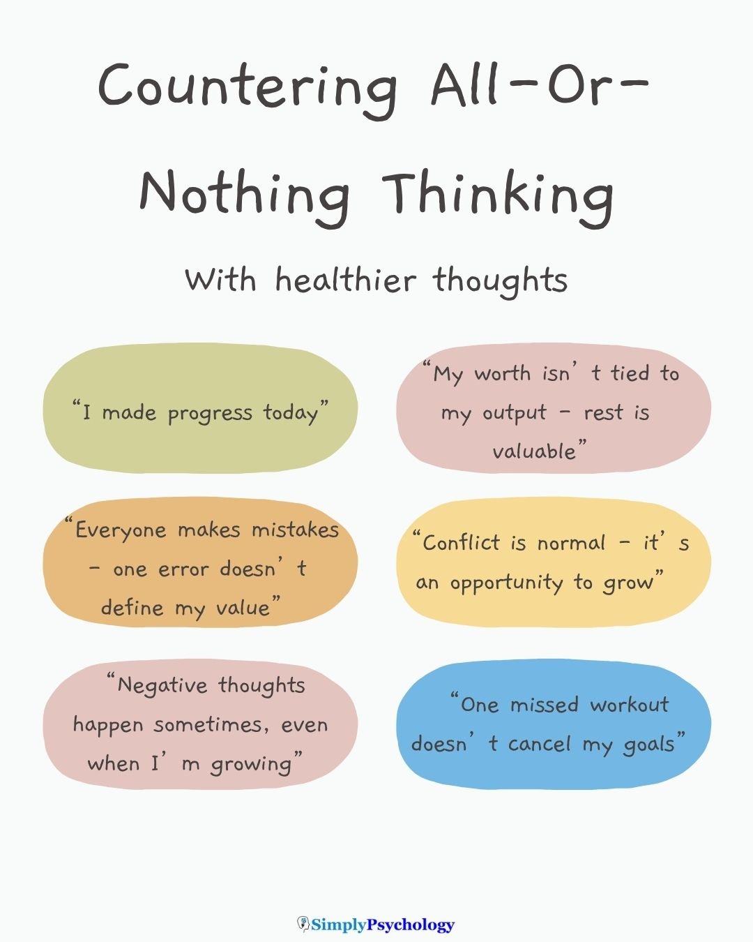
Questioning the “All-or-Nothing” Trap
Many believe that one slip-up destroys the whole effort to change a habit. This “all-or-nothing” thinking wrecks progress and confidence. Research says the truth is less dramatic. Skipping exercise once or having a bad day doesn’t erase weeks of effort. Patterns stick over time, not in a single day.
In fact, seeing setbacks as learning experiences makes people more likely to succeed long term. The goal is steady improvement, not perfection.
When Good Habits Turn Bad
Some routines begin as helpful but turn harmful because of context or excess. For example, dieting can lead to disordered eating, or exercise can become an obsession. Habits aren’t just about the behaviours themselves, but about the relationships people have with those patterns. Too much focus on “maximum productivity” or “constant optimisation” can make habits a new source of stress rather than relief.
Not every routine is worth keeping. And reflecting, sometimes critically, on why any pattern continues is necessary.
Alternative Perspectives: Do Habits Matter As Much As We Think?
Pop culture often suggests that every outcome in life comes down to daily habits. This is comforting but might be too simplistic. Life circumstances, random events, and bigger social factors shape behaviours. Personal discipline does matter, but it isn’t the whole story. Blaming failure or success only on habits ignores the fact that people operate in specific contexts: jobs, communities, health, and economic systems.
Some critics say the focus on habits shifts responsibility away from fixing social problems to the individual. If someone can’t exercise because the streets aren’t safe, “motivation” won’t solve anything.
That said, changing habits is still worth doing. But human lives are more than self-control marathons.
Final Thoughts
Habits run a lot of daily life, free up mental effort, and can be shaped one small step at a time. Good habits make things easier, but bad ones stick too because that’s what the brain is wired to do. Changing routines isn’t about sudden motivation, endless struggle, or shame. It’s about experimenting, making small shifts, and giving routines time to settle.
Don’t expect changing habits to be easy. Don’t assume failure means defeat. And always question whether a habit, once formed, still fits the life wanted.


