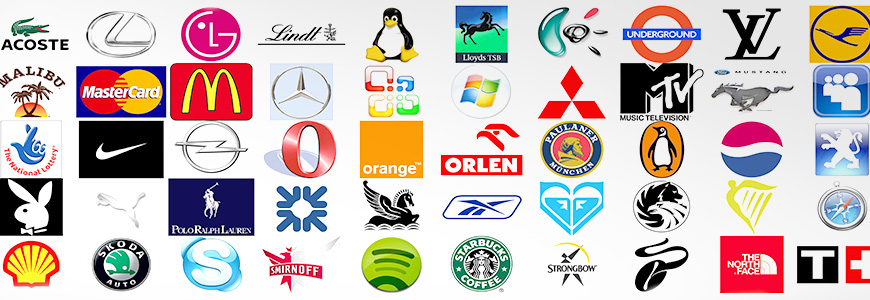
Logos are more than just visual symbols; they are the face of a brand, encapsulating its identity, values, and mission in a single image. Over time, certain logos have transcended their commercial purposes to become global icons.
Logos are more than just visual identifiers; they are powerful tools for storytelling that connect brands with their audiences emotionally and intellectually. Why? Logos make brands memorable, a well-designed logo fosters credibility, and unique logos set brands apart from competitors. By combining aesthetics with meaning, iconic logos have achieved global recognition while effectively communicating their brand values.
Cultural differences play a significant role in shaping how logos are perceived globally. These differences influence the emotional, symbolic, and psychological impact of logo elements such as colours, symbols, typography, and layout.
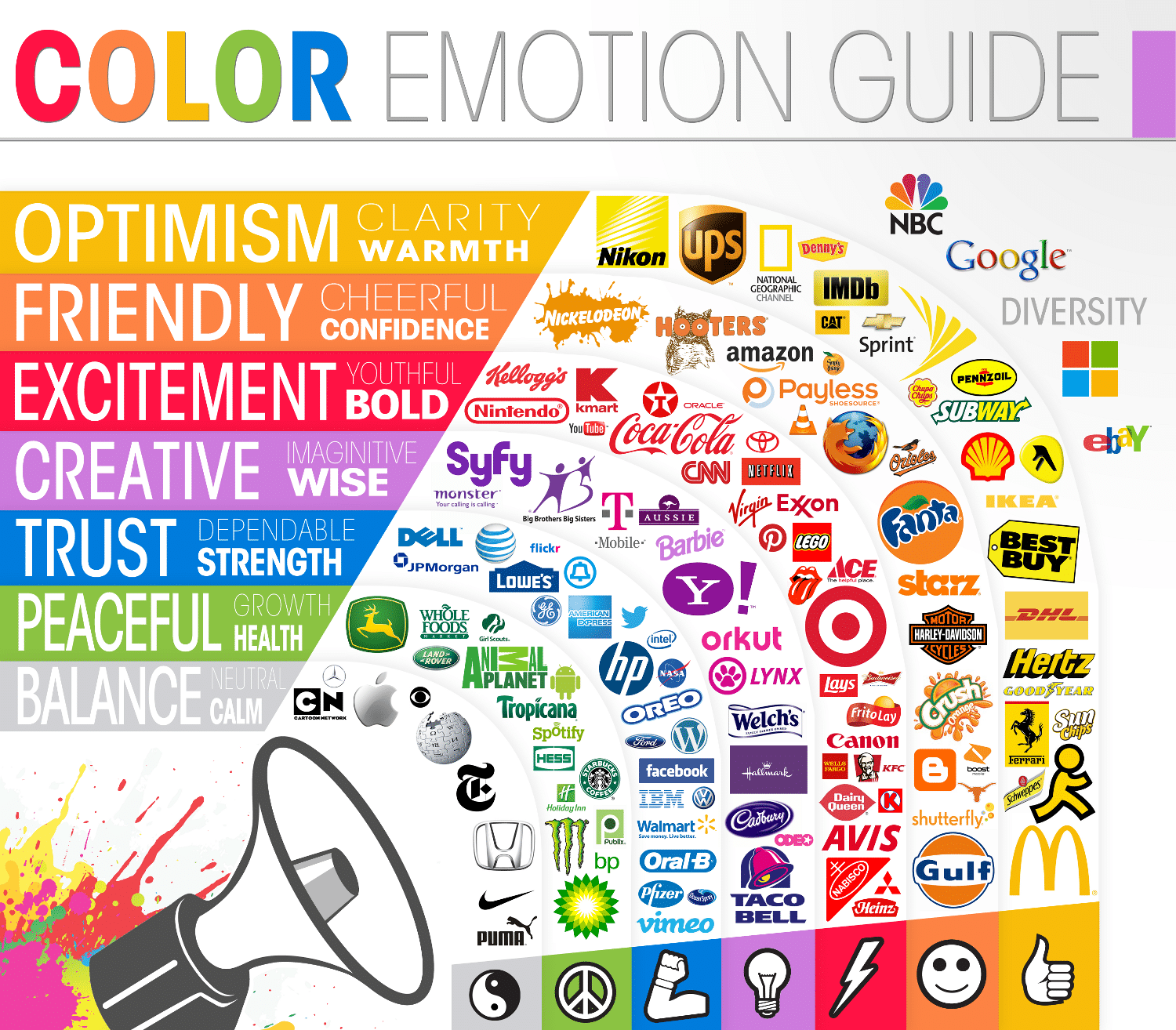
Colours carry distinct meanings in different cultures, which can significantly alter how a logo is interpreted. White often symbolises purity and innocence in Western cultures, while in many Eastern cultures, it represents mourning and death. Red signifies luck and celebration in China but is associated with danger or warning in Western contexts. In Islamic cultures, gr. een is linked to prosperity and faith, while in Western contexts, it often represents nature or eco-friendliness. Designers must carefully select colour palettes to ensure they evoke the intended emotions within specific cultural contexts.
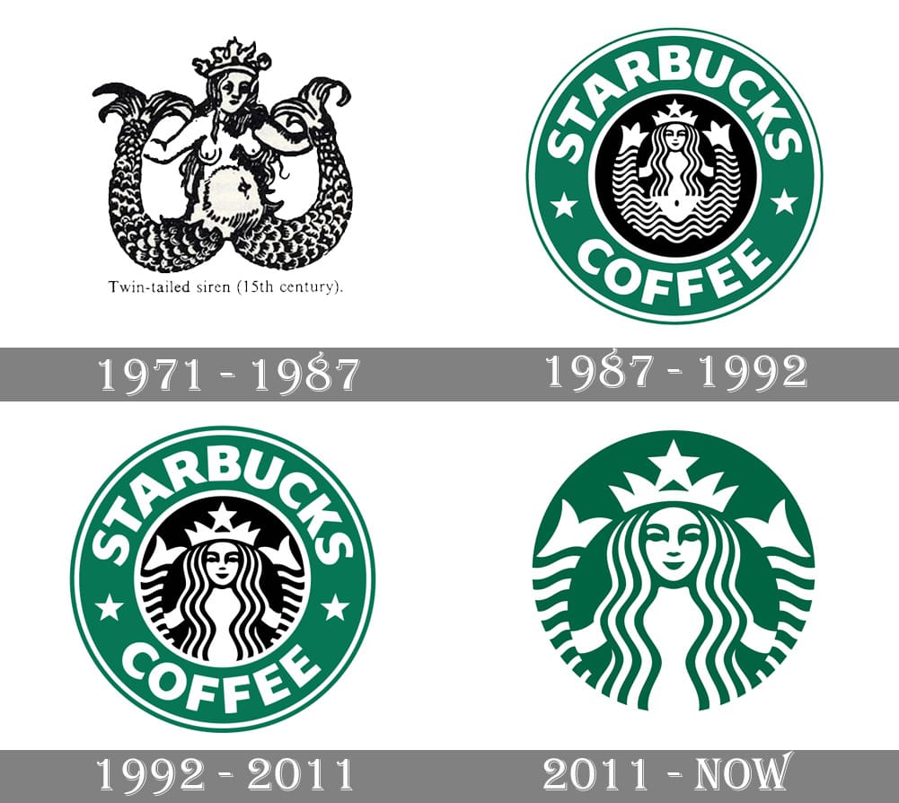
Symbols can have vastly different meanings depending on cultural backgrounds. A lion might symbolise courage and strength in Western cultures but could have different connotations elsewhere. Circular logos may symbolise unity and harmony in some Asian cultures, while angular designs might be perceived as aggressive or dynamic. The use of religious or historical symbols can either resonate deeply or alienate audiences if not handled sensitively. For example, Starbucks’ siren logo resonates globally but might be interpreted differently in regions with conservative views on mythology or nudity.
Typography also plays a crucial role in cultural perception. Serif fonts are often associated with tradition and formality in Western cultures, while sans-serif fonts convey modernity and simplicity. The choice of script must align with linguistic conventions. For instance, playful fonts may be well-received by younger audiences in Western markets but could be seen as unprofessional in Middle Eastern contexts. Logos designed for left-to-right reading may need adjustments for audiences accustomed to right-to-left scripts or top-to-bottom layouts.
Cultural insensitivity can lead to backlash or misinterpretation. PepsiCo faced challenges when its slogan “Pepsi brings you back to life” was translated into Chinese as “Pepsi brings your ancestors back from the grave,” highlighting the importance of linguistic precision. Airbnb’s 2014 logo was criticised for resembling anatomical features, demonstrating how unintended associations can lead to negative publicity even when not explicitly tied to cultural differences. Brands must collaborate with local experts to avoid such pitfalls.
To resonate with diverse audiences, brands often adapt their logos. Incorporating local motifs can foster a sense of belonging. For instance, Coca-Cola has used localised designs during festivals like Ramadan or Chinese New Year. Subtle changes in colour schemes can make logos more appealing to specific regions while maintaining brand identity. Adjusting fonts to match local preferences ensures that logos communicate effectively across languages and scripts.
Logos serve as cultural ambassadors for brands by bridging divides and fostering inclusivity. Logos that reflect cultural diversity demonstrate respect for local traditions and values. Successful cross-cultural logos balance global recognition with local relevance, creating a sense of unity while celebrating diversity. For example, McDonald’s adapts its Golden Arches by incorporating local elements like green hues in European markets to signify eco-consciousness.
Let’s deep dive into some of the most famous and recognisable logos and their meanings:
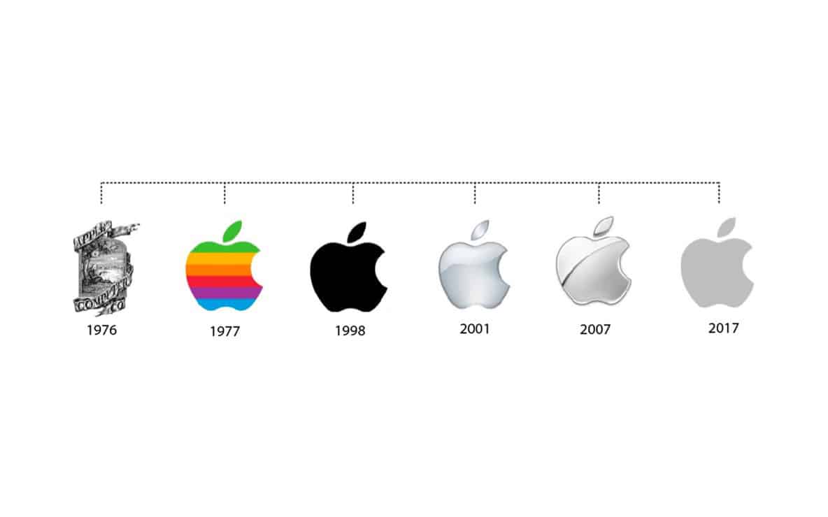
Apple: The Bite of Knowledge and Innovation
The Apple logo is one of the most iconic symbols in technology. Its sleek design, a bitten apple, has sparked numerous interpretations. Some believe it references the biblical story of Adam and Eve, symbolising knowledge and temptation. Others see it as a nod to Alan Turing, the father of modern computing, who allegedly died after biting into a poisoned apple. Regardless of its origins, the logo embodies simplicity, innovation, and creativity, aligning perfectly with Apple’s brand ethos.
Nike: The Swoosh of Motion
Nike’s “Swoosh” logo is synonymous with athleticism and movement. Designed by Carolyn Davidson in 1971, the swoosh represents motion and speed, inspired by the wings of Nike, the Greek goddess of victory. Over the years, this minimalist design has become a global symbol of sports excellence and perseverance. Paired with the slogan “Just Do It,” it inspires millions to push their limits.
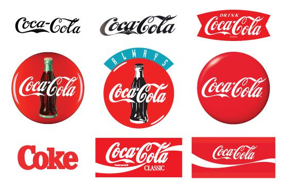
Coca-Cola: A Script of Nostalgia
The Coca-Cola logo is a timeless classic that has remained largely unchanged since its creation in 1886. Its flowing cursive script exudes energy and vitality, mirroring the effervescence of the drink itself. The red-and-white color scheme evokes passion and purity, making it instantly recognisable worldwide. This logo represents not only a beverage but also a lifestyle filled with joy and refreshment.
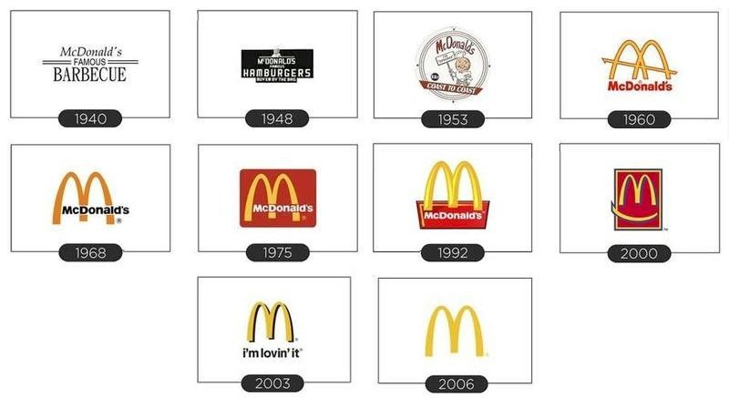
McDonald’s: The Golden Arches
McDonald’s iconic Golden Arches symbolise more than just fast food; they represent comfort, reliability, and global reach. The arches form a stylised “M,” evoking openness and inclusivity. The vibrant red and yellow colors are designed to stimulate appetite while conveying speed and efficiency, key elements of McDonald’s brand identity.
Google: A Playful Palette
The Google logo is as vibrant as the company itself. Its multicoloured design reflects diversity, creativity, and innovation: core values that define Google’s mission to make information accessible to everyone. The choice of primary colours, with green breaking the pattern, signifies playfulness and approachability, making it one of the most recognised logos globally.
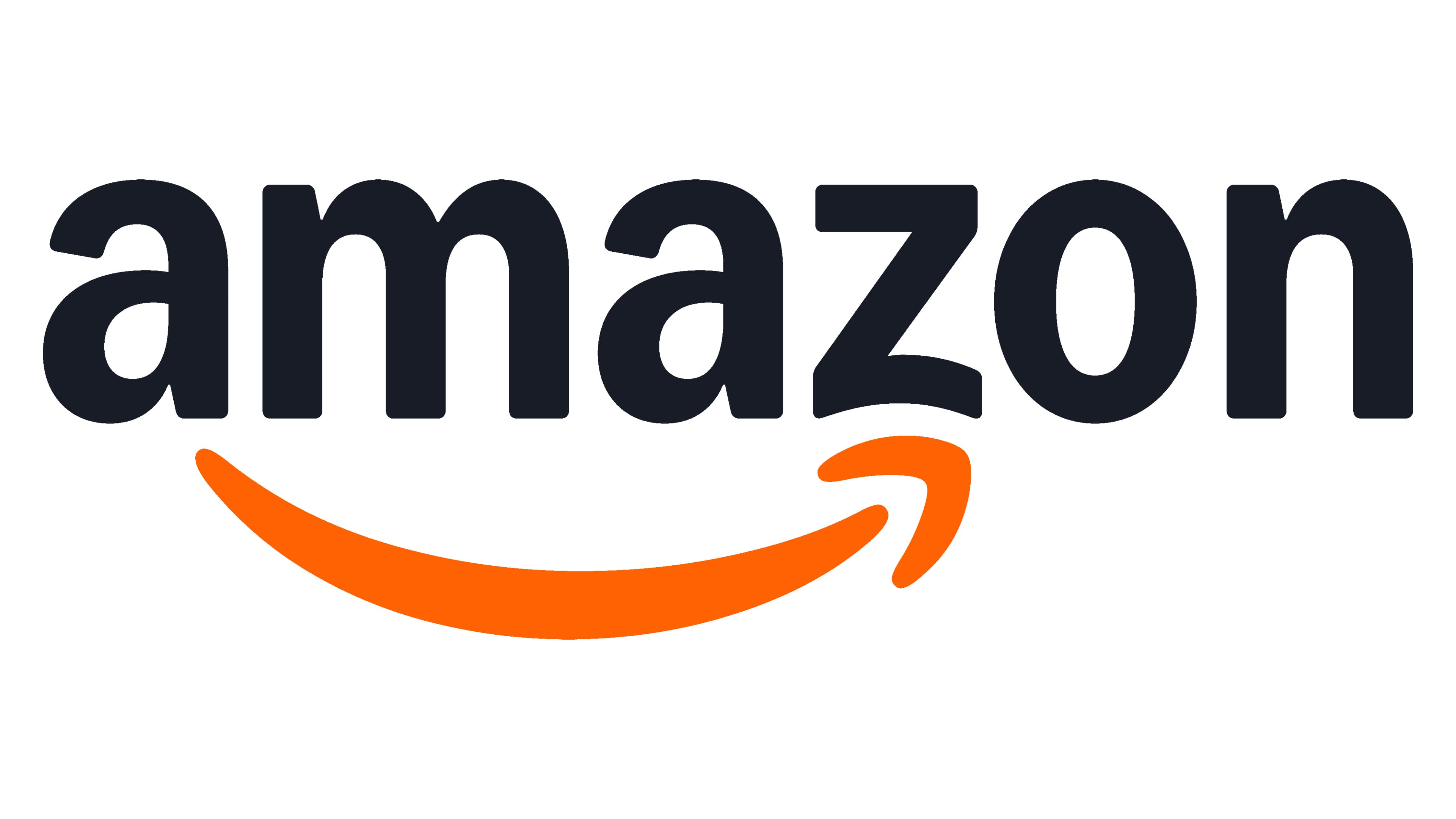
Amazon: Smiling from A to Z
Amazon’s logo is deceptively simple yet packed with meaning. The orange arrow beneath the wordmark doubles as a smile, symbolizing customer satisfaction. It also points from “A” to “Z,” highlighting Amazon’s vast product range. This clever design encapsulates convenience, variety, and happiness, hallmarks of Amazon’s service.
Starbucks: The Siren’s Allure
Starbucks’ logo features a twin-tailed mermaid or siren, a nod to its maritime origins in Seattle and its seductive allure as a coffee brand. Inspired by a 16th-century Norse woodcut, the logo symbolises community and indulgence while maintaining an air of sophistication through its green-and-white palette.
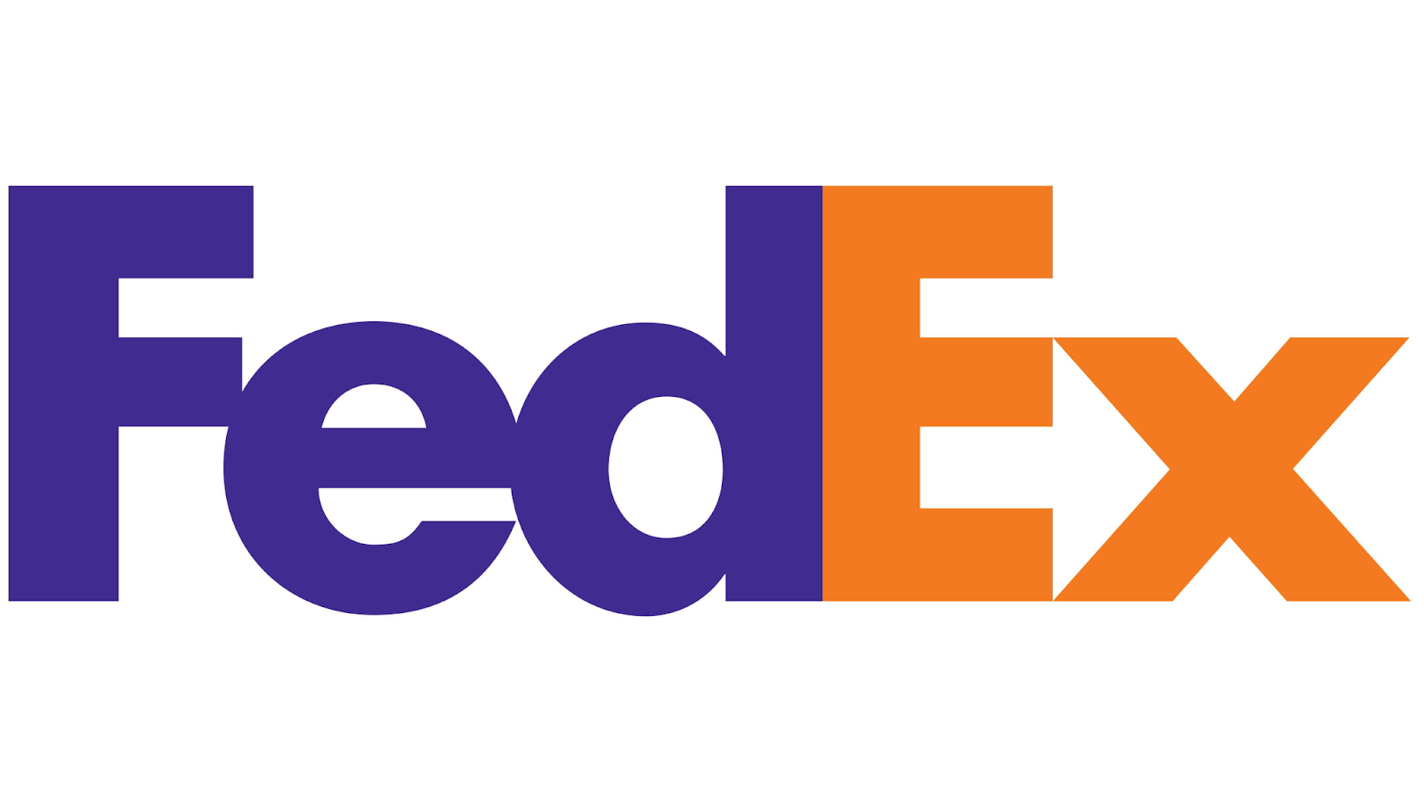
FedEx: Hidden Speed
The FedEx logo is renowned for its hidden arrow between the “E” and “X,” symbolising speed and precision in delivery services. This subtle yet powerful design element underscores FedEx’s commitment to reliability and efficiency while maintaining a clean, professional aesthetic.
Microsoft: A Window into Innovation
Microsoft’s logo features four coloured squares forming a window: a metaphor for opportunity and innovation in technology. Each colour represents a different product line: blue for Windows OS, red for Office Suite, green for Xbox, and yellow for future possibilities. This modern design reflects Microsoft’s versatility and forward-thinking approach.
Walt Disney: A World of Magic
The Walt Disney logo is an enchanting representation of childhood wonder and creativity. Its custom typography evokes nostalgia while capturing Disney’s playful spirit. Often accompanied by an image of Cinderella’s castle or fireworks, this logo invites audiences into a magical world full of imagination.
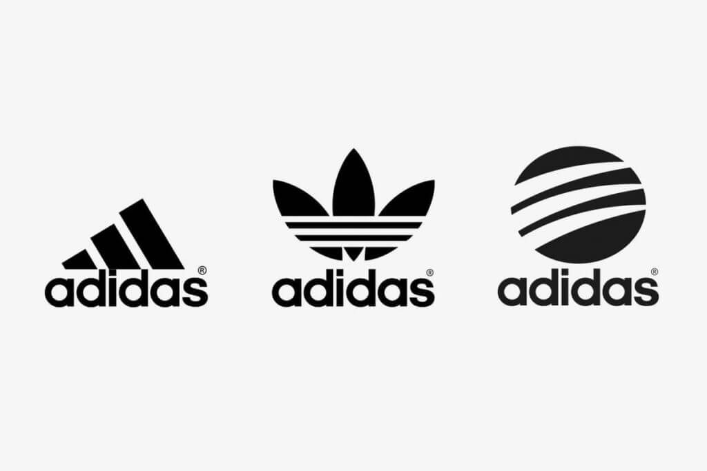
Adidas: The Three Stripes
Adidas’ three-stripe logo symbolises performance and endurance in sportswear. Originally designed to stabilise shoes, the stripes have evolved into a global emblem representing resilience and athletic achievement.
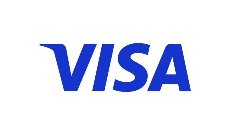
Visa: Trust in Blue
Visa’s logo uses blue to evoke trustworthiness and reliability: qualities essential for a financial services company. Its clean typography reflects modernity while emphasising security in transactions worldwide.
Shell: Energy Personified
Shell’s yellow-and-red scallop shell design reflects its roots in oil exploration while symbolising energy and sustainability today. The bright colours make it stand out at service stations globally.
IBM: Stripes of Progress
IBM’s striped blue wordmark conveys stability and innovation simultaneously. The parallel lines suggest speed and efficiency while maintaining an approachable corporate identity.
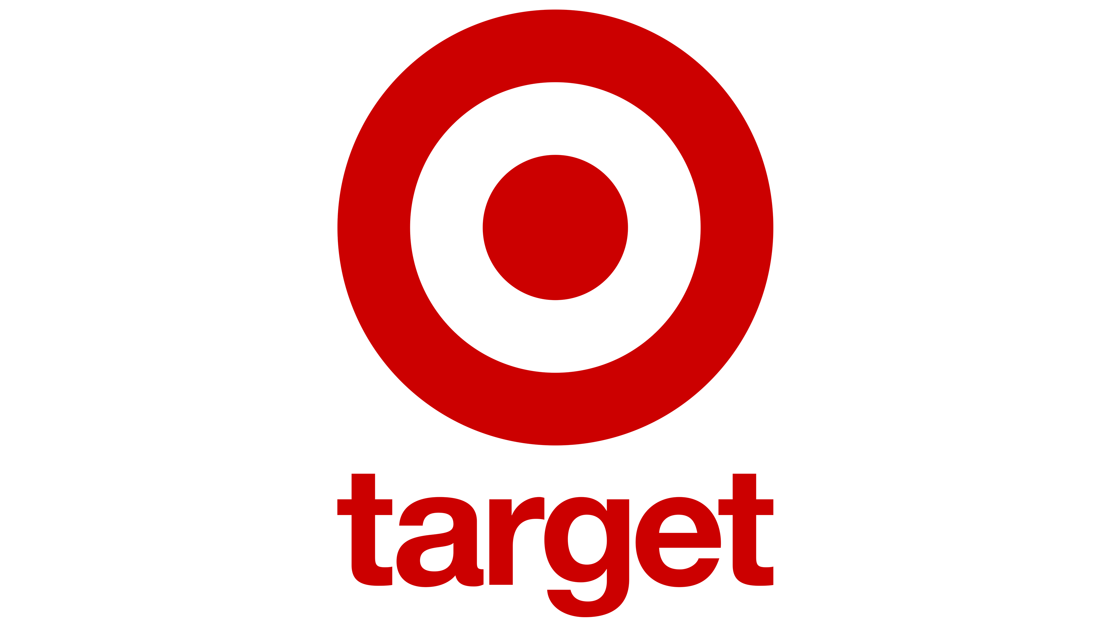
Target: Bullseye Simplicity
Target’s red bullseye is one of the simplest yet most effective logos globally. It symbolises precision while reflecting Target’s goal to be at the center of consumers’ shopping needs.
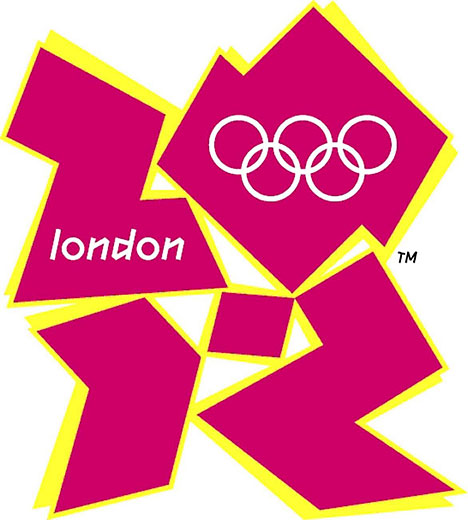
Logos are critical in defining a brand’s identity, but when poorly designed, they can confuse, alienate, or even offend audiences. The London 2012 Olympics logo faced widespread criticism for being overly abstract and difficult to interpret. Designed to represent the numbers “2012,” many viewers found it visually jarring and disconnected from the spirit of the event. Additionally, some perceived hidden inappropriate imagery within the design, further fueling backlash. Over 48,000 people signed a petition to scrap the logo, citing its failure to represent London or the Olympics effectively.
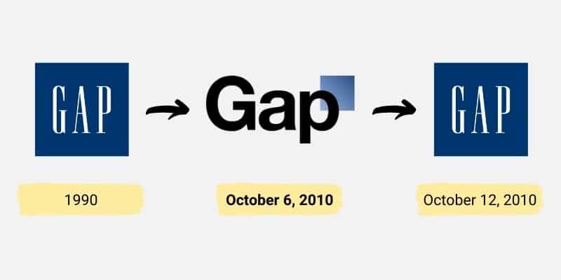
Gap’s attempt to modernise its logo in 2010 was met with immediate public outrage. The new design replaced the iconic serif font with Helvetica and added a small blue square, which critics described as bland and uninspired. Within days of its launch, backlash on social media prompted Gap to revert to its original logo. The failure stemmed from a lack of consumer consultation and an emotional disconnect with loyal customers who felt alienated by the abrupt change.
Pepsi’s redesign of its globe logo aimed to evoke smiles but instead confused consumers. The tilted white stripe was inconsistent across product lines, leading to criticism that it resembled a “fat man.” Despite spending $1 million on the redesign, Pepsi faced negative feedback for its lack of creativity and failure to resonate with customers accustomed to the previous design.
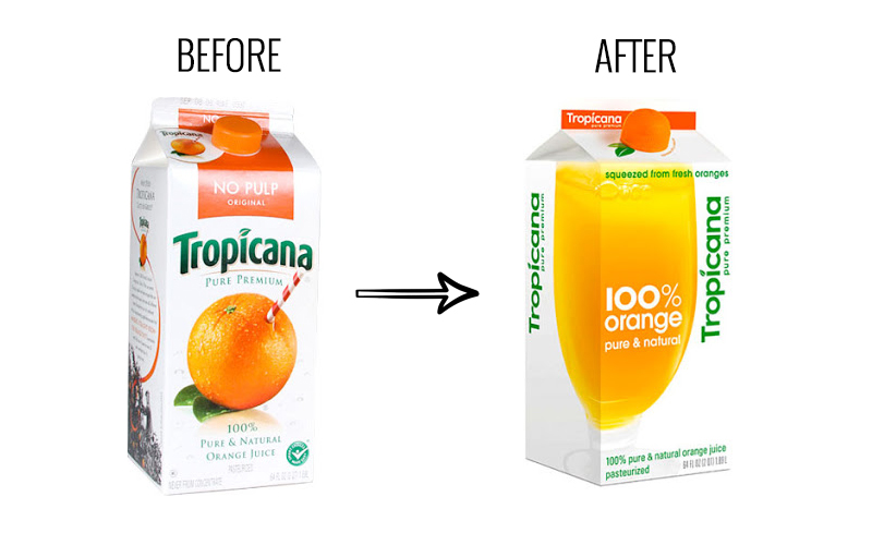
Tropicana’s rebranding involved changing its packaging design rather than the logo itself, but it serves as an example of how visual identity impacts perception. The new design removed familiar elements like the orange-with-a-straw image, making it look generic and hard to distinguish from competitors. Consumer backlash was so strong that Tropicana reverted to its original packaging within two months.
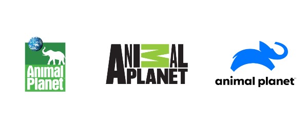
Animal Planet’s decision to replace its elephant-themed logo with a sideways “M” was widely criticized for losing its niche representation. The new design failed to communicate the channel’s focus on wildlife and nature, leaving audiences disconnected from its purpose. This arbitrary change resulted in a setback for the brand.
Bing’s 2013 redesign aimed for simplicity but lacked originality and failed to stand out against competitors like Google. The uninspired design contributed to Bing’s struggle in gaining traction among users.
A satellite company’s logo merged “Sat” and “An” without proper spacing, resulting in an unintended association with Satan—a clear example of how typography can lead to disastrous branding outcomes.
Key reasons why logos fail include a misalignment with brand identity, poor execution, overcomplication or oversimplification, ignoring consumer feedback, and cultural sensitivity issues. Failed logos offer valuable insights into effective branding. These include conducting thorough market research before launching a redesign, testing logos across different demographics and cultural contexts, prioritising simplicity while ensuring symbolic significance, and consistently aligning visual identity with brand values. By learning from these mistakes, brands can create logos that resonate deeply with their audiences while avoiding costly missteps.
In conclusion, each famous logo carries its own story: a blend of history, culture, design ingenuity, and branding strategy that resonates across borders and generations.


